Table of Contents
Introduction: The Recipe for the Best Restaurant Website Design
In the digital age, a restaurant’s website is often the first impression a potential diner gets. It’s your virtual storefront, menu board, and maître d’ all rolled into one. But what makes for the best restaurant website design? For more insights on effective restaurant marketing strategies, check out our comprehensive guide.
Why a well-designed website is crucial for restaurants
The best restaurant website design can be the difference between a full house and empty tables. It’s your 24/7 ambassador, working tirelessly to attract and inform potential customers. According to a study by MGH, 77% of diners visit a restaurant’s website before deciding to dine in or order out. That’s a lot of first impressions!
In today’s digital world, a well-designed website is no longer a luxury for restaurants, it’s a necessity. Your website is often the first touchpoint a potential customer has with your restaurant, and it needs to make a positive and lasting impression. A best restaurant website deisgn can help you achieve this.
Key ingredients of successful restaurant websites
The best restaurant website design combines:
- Mouth-watering visuals
- Easy-to-digest information
- Smooth user experience
- A dash of the restaurant’s unique flavor
It’s a tall order, but get it right, and you’ll have diners salivating before they even step through your doors. The best restaurant website design will be a powerful tool for attracting new customers and keep existing ones coming back for more.
Essential Elements of the Best Restaurant Website Design
User-friendly navigation and intuitive layout
Your website should be as easy to navigate as your restaurant floor. Clear menus, logical flow, and no hidden corners where information gets lost. Think of your homepage as your host, guiding visitors to exactly what they’re looking for. Learn more about creating the best restaurant website design to attract more customers.
Mobile responsiveness and fast loading times
In today’s fast-paced world, your website needs to keep up. Google reports that 53% of mobile users abandon sites that take over 3 seconds to load. Make sure your site looks great and loads quickly on all devices.
High-quality food photography and imagery
We eat with our eyes first. High-quality, appetizing photos can make mouths water and reservations soar. But remember, authenticity is key. Those photos should represent what actually lands on the plate. What you show must be what you present.
Clear and easily accessible menus
Your menu is the star of the show. Make it easy to find and read. Consider including prices to help diners make informed decisions. And don’t forget about dietary information – it’s not just nice, it’s necessary for many diners.
Online ordering and reservation systems
Make it easy for customers to commit to a visit. Integrated reservation systems and online ordering can turn browsing into bookings with just a few clicks.
Location and contact information prominence
Your address, phone number, and hours should be front and center. Don’t make potential customers hunt for this crucial information. Consider adding an embedded map for easy directions.
Showcasing Culinary Excellence: Top Restaurant Website Designs
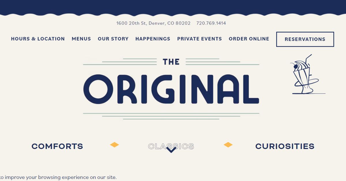
The Original: Illustration-driven design for a unique experience
The Original takes a different approach, using playful illustrations to create a unique and memorable website. It’s proof that the best restaurant website design can be as creative as the menu.
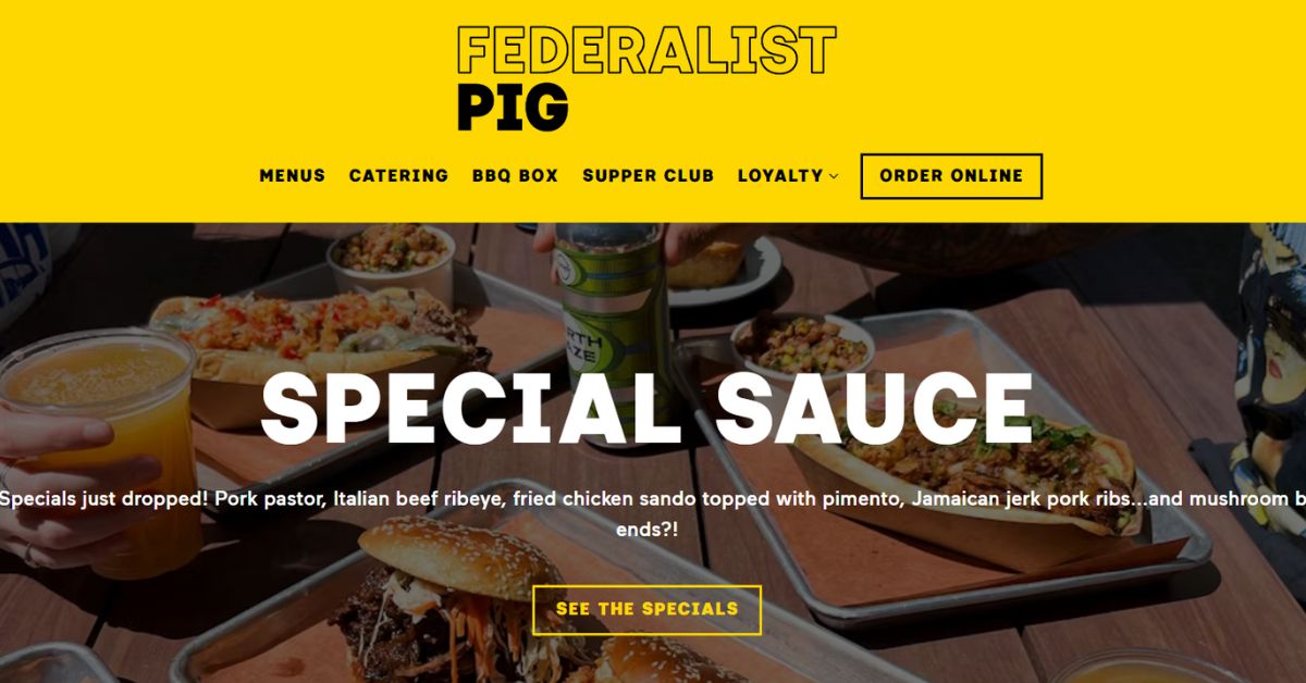
Federalist Pig: Vibrant aesthetics and easy navigation
Federalist Pig’s website is as bold and flavorful as its BBQ. Vibrant colors and clear navigation make exploring the site as enjoyable as the food.
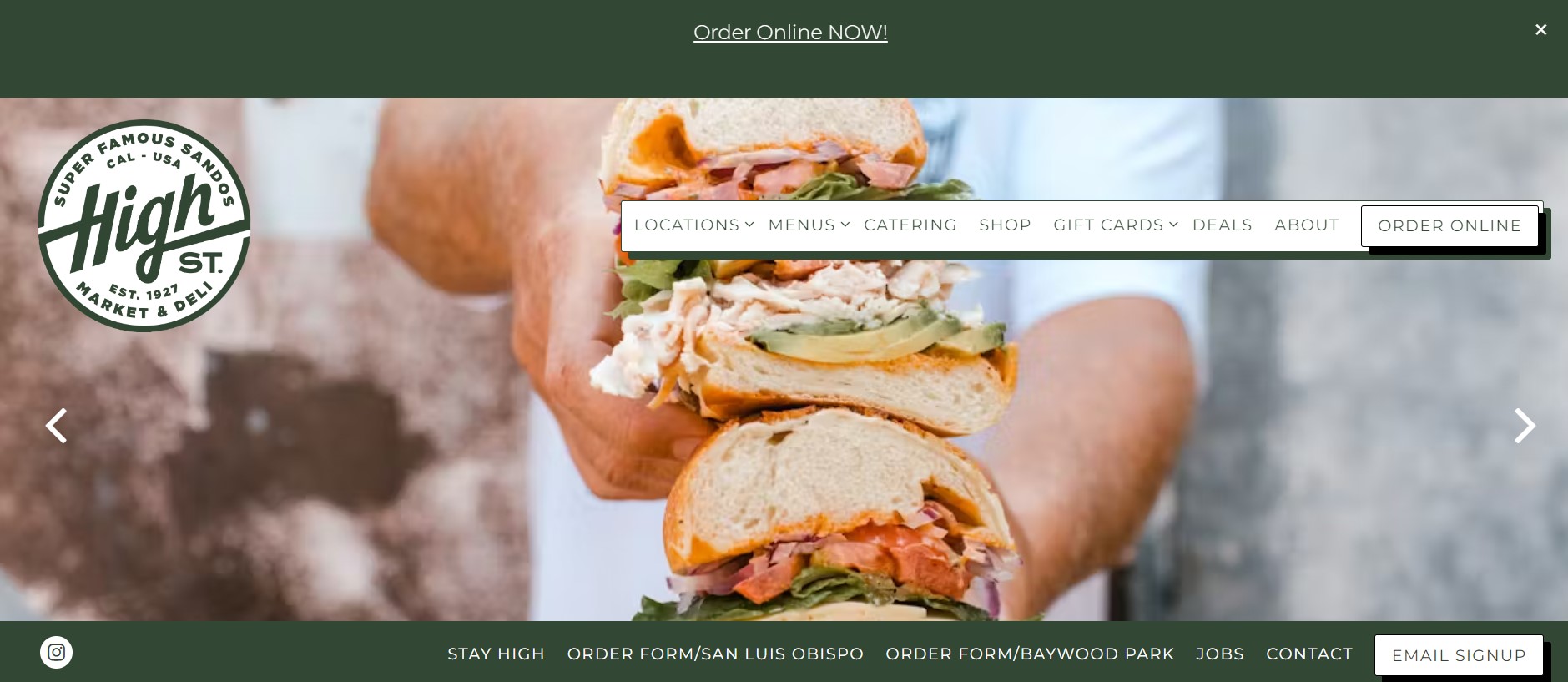
High Street Market & Deli: Modern e-commerce integration
High Street Market & Deli seamlessly integrates e-commerce, allowing customers to order food, buy merchandise, and book events all in one place.
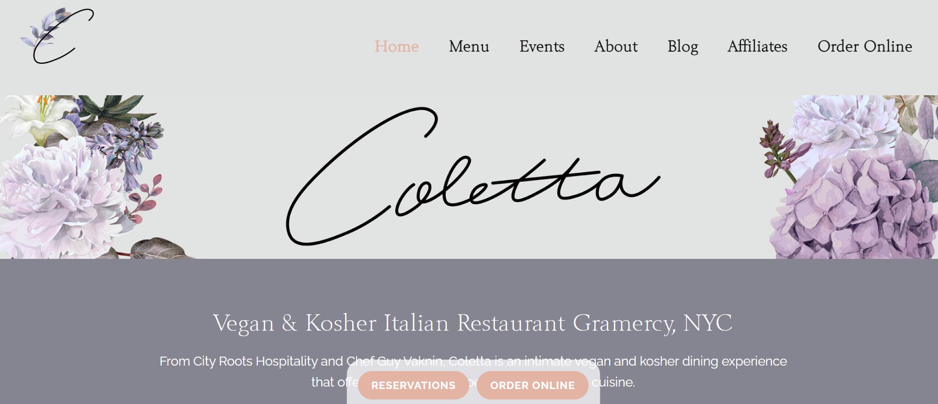
Colletta: Mobile-first design for the on-the-go diner
Colletta’s website shines on mobile devices, proving that the best restaurant website design adapts to how people actually use it.
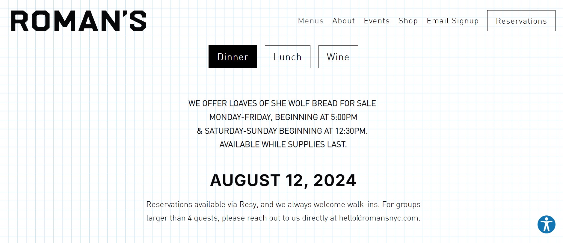
Roman’s: Subtle sophistication in web design
Roman’s website uses a subtle, sophisticated design that lets the food take center stage. It’s a reminder that sometimes, less is more.
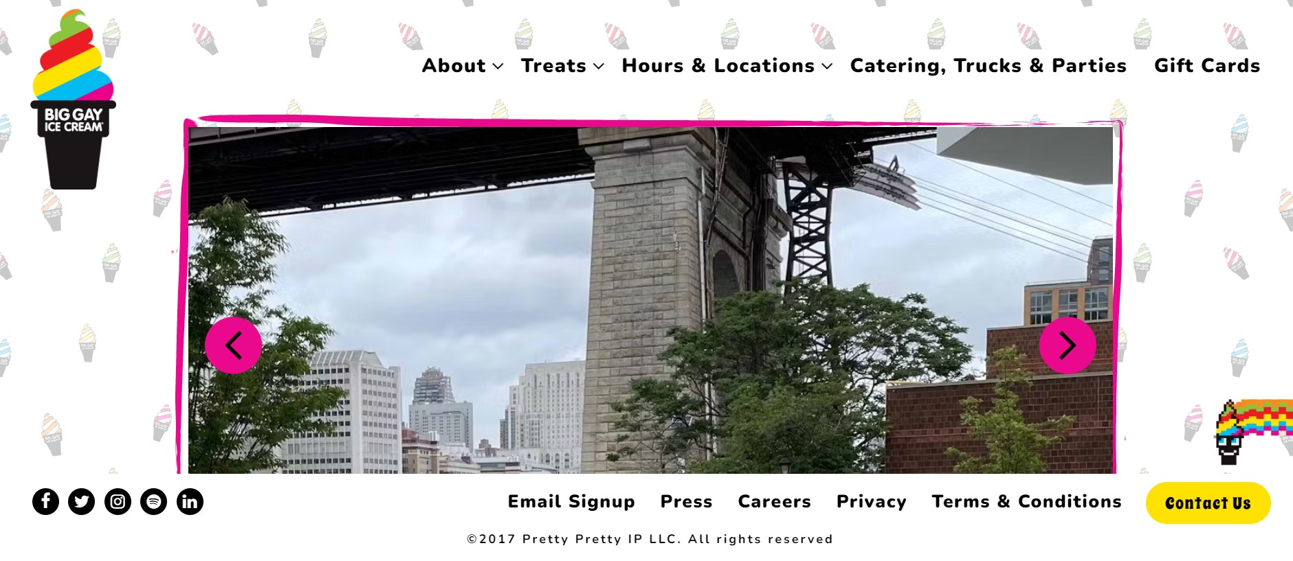
Big Gay Ice Cream: Fun branding translated to digital
Big Gay Ice Cream’s website is as fun and colorful as its name suggests. It’s a perfect example of how to translate brand personality into digital design.
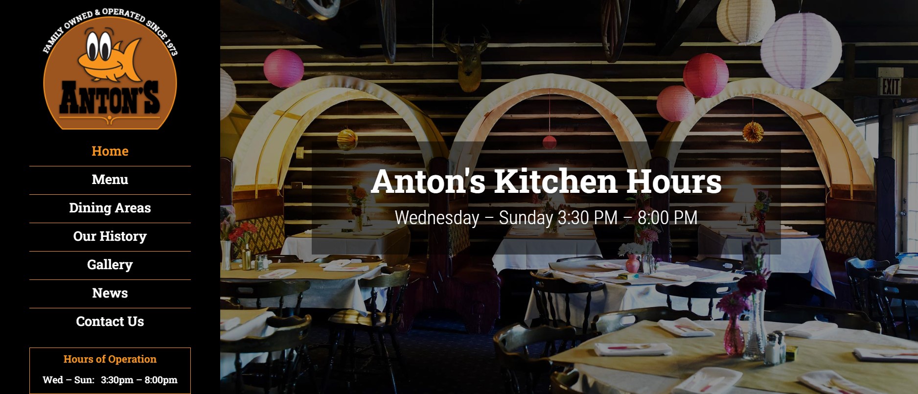
Anton’s: Neo-classical design with modern functionality
Anton’s blends classic aesthetics with modern functionality, creating a website that feels both timeless and contemporary.
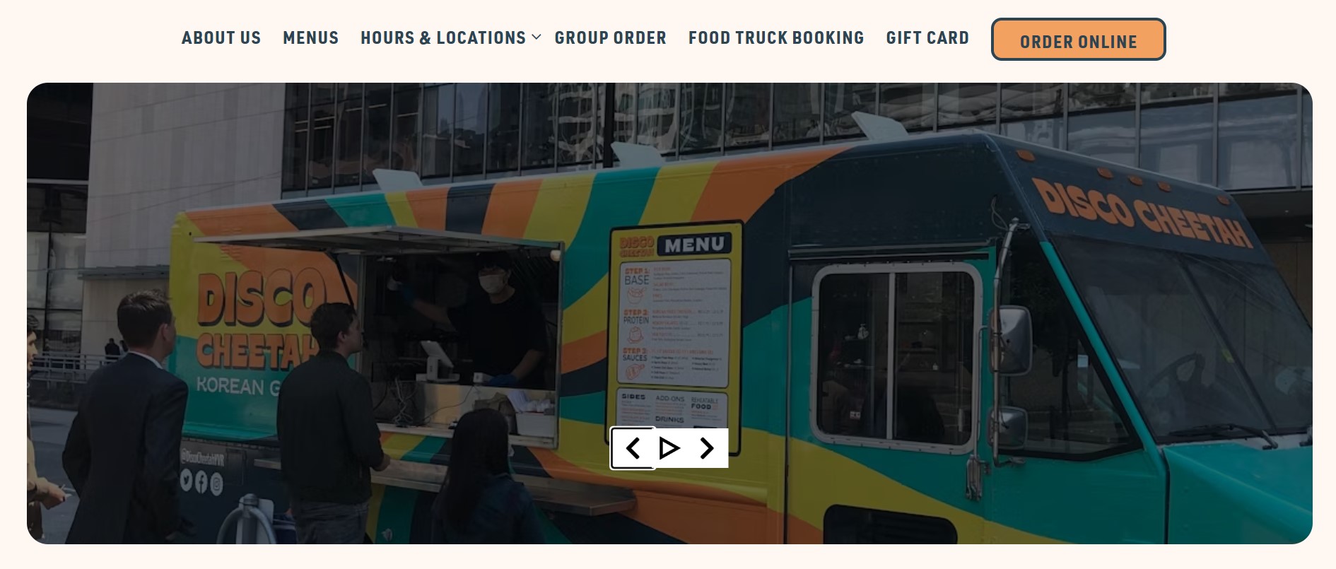
Disco Cheetah: Bold colors and seamless online ordering
Disco Cheetah’s website is a riot of color and energy, with an online ordering system that’s as smooth as their sauce.
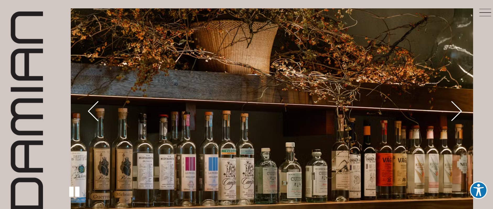
Damian: Minimalism that lets the food shine
Damian’s website is a study in minimalism, using negative space and high-quality imagery to create a sense of luxury and exclusivity.
Cultural Fusion in Restaurant Website Design
China Poblano: Blending cultures through visual elements
China Poblano’s website beautifully blends Chinese and Mexican visual elements, reflecting the restaurant’s unique culinary fusion.
Miss Lily’s: Capturing Caribbean vibes digitally
Miss Lily’s website brings the vibrant energy of the Caribbean to life with bold colors and dynamic design elements.
Ophelia: Enchanting design with a touch of mystery
Ophelia’s website uses atmospheric imagery and subtle animations to create an air of mystery and allure.
Casual Dining Websites Done Right
The Tailor’s Son: Unpretentious design for a relaxed atmosphere
The Tailor’s Son’s website reflects the restaurant’s casual, welcoming vibe with warm colors and inviting imagery.
Diner: Nostalgia meets modernity in web design
Diner’s website balances retro aesthetics with modern functionality, creating a nostalgic yet user-friendly experience.
Tiki Chick: Tropical paradise in pixels
Tiki Chick’s website transports visitors to a digital tropical paradise, perfectly capturing the restaurant’s fun, vacation-like atmosphere.
Luxury Dining Experiences Reflected Online
Francie: Elevating the digital dining experience
Francie’s website exudes luxury, with rich imagery and elegant typography that sets expectations for a high-end dining experience.
Reign: Grandiose imagery for high-end restaurants
Reign uses stunning, full-screen imagery to create a sense of grandeur that matches its upscale dining experience.
Technical Aspects of the Best Restaurant Website Design
SEO optimization for local search
Local SEO for restaurants is crucial. Optimize your site with local keywords, Google My Business integration, and location-specific content.
Integration with social media platforms
Seamlessly integrate your social media feeds to keep your website fresh and encourage engagement.
Accessibility considerations for all users
Ensure your website is accessible to all users, including those with disabilities. This isn’t just good practice – it’s essential for reaching all potential customers.
Analytics and user behavior tracking
Use tools like Google Analytics to track user behavior and optimize your site accordingly. Understanding how visitors interact with your site is key to improving it.
Content Strategies for Restaurant Websites
Storytelling through chef profiles and restaurant history
Share your restaurant’s story. Highlight your chef’s background, your restaurant’s history, or your commitment to local sourcing.
Blog integration for recipes and culinary content
A blog can keep your website fresh and provide value to visitors. Share recipes, cooking tips, or behind-the-scenes content. Explore successful restaurant marketing campaign ideas to inspire your own promotional efforts.
Video content: Virtual tours and cooking demonstrations
Video content can bring your restaurant to life online. Consider virtual tours, chef interviews, or cooking demonstrations.
E-commerce Integration in Restaurant Websites
Gift card sales and merchandise stores
Expand your revenue streams by selling gift cards or branded merchandise directly through your website.

Catering and special event booking systems
Make it easy for customers to book catering services or special events through your website.
Customer Engagement Features
Newsletter sign-ups and loyalty programs
Encourage repeat visits with a newsletter or loyalty program.
Customer review integration and management
Showcase positive reviews and respond to feedback directly on your site. This transparency builds trust with potential customers. Learn effective techniques for managing and responding to Google reviews to maintain a positive online presence.
Interactive elements: Virtual menus, 360° restaurant tours
Engage visitors with interactive elements like virtual menus or 360° tours of your space.
Emerging Trends in Restaurant Website Design
AI-powered chatbots for instant customer service
Chatbots can handle reservations, answer FAQs, and provide instant customer service, even outside business hours.
Augmented reality menus and experiences
AR technology can allow customers to visualize dishes or explore your restaurant space from home.

Sustainability features highlighting eco-friendly practices
If sustainability is part of your brand, showcase it on your website. Highlight eco-friendly practices or local sourcing initiatives.
DIY vs Professional Restaurant Website Design
Pros and cons of using website builders
Website builders can be a cost-effective solution, but they may limit customization. Weigh the pros and cons based on your needs and budget.
When to invest in professional web design services
For unique designs or complex functionality, professional web design services may be worth the investment.
Maintaining and updating your restaurant website
Regular updates keep your website fresh and relevant. Plan for ongoing maintenance as part of your digital strategy.
Measuring Success: KPIs for Restaurant Websites
Traffic and engagement metrics
Monitor visitor numbers, time on site, and bounce rates to gauge your website’s performance. Use a local rank tracking tool to monitor your restaurant’s visibility in local search results.
Conversion rates for bookings and online orders
Track how many website visits result in reservations or orders to measure your site’s effectiveness.
User feedback and satisfaction scores
Collect and analyze user feedback to continually improve your website experience.
Conclusion: Serving Up the Best Restaurant Website Design
The best restaurant website design is a perfect blend of form and function, acting as your digital storefront, maître d’, and menu board all rolled into one. It should whet appetites with mouthwatering visuals, provide information clearly and concisely, and make the path from browsing to booking as smooth as a well-aged wine.
Remember, your website is often the first interaction a potential diner has with your restaurant. Make it count. With the right ingredients and a dash of creativity, your website can be as inviting as your dining room.
Bon appétit, digital diners!
FAQ
What are the most important features of a restaurant website?
Key features include an easy-to-navigate menu, high-quality photos, online ordering or reservation system, and clear contact information.
How often should I update my restaurant’s website?
Regular updates are crucial. Aim to update your menu seasonally, and refresh other content at least monthly.
Is it worth investing in professional web design for my restaurant?
While DIY options exist, professional design can provide a unique, high-quality site that truly represents your brand and functionality needs.


